javascript
73 lines · 10 steps
Building a keyboard-accessible MultiSelect in React
A controlled multi-select combobox that manages open state, keyboard navigation, and selection toggling while staying ARIA-compliant.
Explained by
highlit
1import { useState, useRef, useCallback } from "react";
2
3export function MultiSelect({ options, value, onChange, placeholder = "Select…" }) {
4 const [open, setOpen] = useState(false);
5 const [active, setActive] = useState(0);
6 const listRef = useRef(null);
7
8 const toggle = useCallback(
9 (opt) => {
10 const next = value.includes(opt.id)
11 ? value.filter((id) => id !== opt.id)
12 : [...value, opt.id];
13 onChange(next);
14 },
15 [value, onChange]
16 );
17
18 function handleKeyDown(e) {
19 switch (e.key) {
20 case "ArrowDown":
21 e.preventDefault();
22 setOpen(true);
23 setActive((i) => Math.min(i + 1, options.length - 1));
24 break;
25 case "ArrowUp":
26 e.preventDefault();
27 setActive((i) => Math.max(i - 1, 0));
28 break;
29 case "Enter":
30 case " ":
31 e.preventDefault();
32 if (open) toggle(options[active]);
33 else setOpen(true);
34 break;
35 case "Escape":
36 setOpen(false);
37 break;
38 }
39 }
40
41 const selected = options.filter((o) => value.includes(o.id));
42
43 return (
44 <div className="multiselect" onKeyDown={handleKeyDown}>
45 <button
46 type="button"
47 role="combobox"
48 aria-expanded={open}
49 aria-haspopup="listbox"
50 onClick={() => setOpen((o) => !o)}
51 >
52 {selected.length ? selected.map((o) => o.label).join(", ") : placeholder}
53 </button>
54 {open && (
55 <ul role="listbox" aria-multiselectable="true" ref={listRef}>
56 {options.map((opt, i) => (
57 <li
58 key={opt.id}
59 role="option"
60 aria-selected={value.includes(opt.id)}
61 className={i === active ? "active" : undefined}
62 onMouseEnter={() => setActive(i)}
63 onClick={() => toggle(opt)}
64 >
65 <input type="checkbox" readOnly checked={value.includes(opt.id)} />
66 {opt.label}
67 </li>
68 ))}
69 </ul>
70 )}
71 </div>
72 );
73}
01 / 01
STEP 01
‹ swipe to step through ›
Walkthrough
Space play
←→ step
click any line
Three takeaways
- 1Controlled components delegate the source of truth to a parent via value and onChange rather than owning selection internally.
- 2Tracking a separate active index lets keyboard and mouse share one highlight without changing the actual selection.
- 3ARIA roles like combobox, listbox, and option turn a custom widget into something screen readers understand.
Related explainers
javascript
function evaluate(expression) {
  const tokens = tokenize(expression);
  let pos = 0;
Building a recursive descent calculator
parsing
recursion
operator-precedence
Intermediate
8 steps
typescript
import { Injectable, effect, signal, computed } from '@angular/core';

interface Preferences {
  theme: 'light' | 'dark';
A signal-based preferences store in Angular
signals
state-management
persistence
Intermediate
7 steps
javascript
import { useState, useEffect, useCallback, useRef } from 'react';

const cache = new Map();
const inflight = new Map();
Building a stale-while-revalidate hook in React
caching
request-deduplication
custom-hooks
Advanced
10 steps
typescript
import { useEffect, useState } from "react";

interface Section {
  id: string;
Building a scroll-spy hook in React
custom-hooks
intersectionobserver
dom-observation
Intermediate
8 steps
javascript
import { useEffect, useRef, useState } from 'react';

export function useDelayedFlag(active, delay = 300) {
  const [visible, setVisible] = useState(false);
Delaying a loading spinner with a React hook
custom-hooks
debouncing
cleanup
Intermediate
8 steps
javascript
const SWIPE_THRESHOLD = 80;
const MAX_TRANSLATE = 120;

export function attachSwipeToDismiss(element, onDismiss) {
Building a swipe-to-dismiss gesture in JS
touch-events
gesture-detection
dom-manipulation
Intermediate
10 steps
Share this explainer
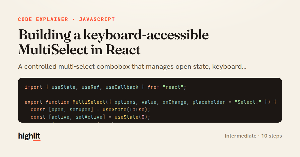
Here's the card — post it anywhere.
Made with highlit — turn any snippet into a walkthrough like this in about a minute.
Explain your code
Embed this explainer
Drop the interactive walkthrough into a blog or docs. Views never cost a credit.
<iframe src="https://highlit.co/explainers/building-a-keyboard-accessible-multiselect-in-react-explained-javascript-7577/embed?autoplay=1" width="100%" height="520" loading="lazy" style="border:0"></iframe>
Autoplay is on by default — add ?autoplay=0 to start paused.