javascript
43 lines · 8 steps
Building an accessible star rating in React
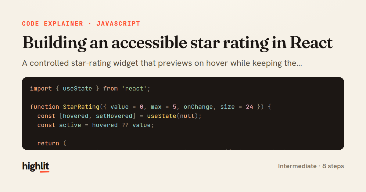
A controlled star-rating widget that previews on hover while keeping the committed value and screen-reader semantics distinct.
Explained by
highlit
1import { useState } from 'react';
2
3function StarRating({ value = 0, max = 5, onChange, size = 24 }) {
4 const [hovered, setHovered] = useState(null);
5 const active = hovered ?? value;
6
7 return (
8 <div role="radiogroup" aria-label="Rating" style={{ display: 'inline-flex', gap: 4 }}>
9 {Array.from({ length: max }, (_, i) => {
10 const rating = i + 1;
11 const filled = rating <= active;
12 return (
13 <button
14 key={rating}
15 type="button"
16 role="radio"
17 aria-checked={rating === value}
18 aria-label={`${rating} star${rating > 1 ? 's' : ''}`}
19 onClick={() => onChange?.(rating === value ? 0 : rating)}
20 onMouseEnter={() => setHovered(rating)}
21 onMouseLeave={() => setHovered(null)}
22 onFocus={() => setHovered(rating)}
23 onBlur={() => setHovered(null)}
24 style={{
25 background: 'none',
26 border: 'none',
27 padding: 0,
28 cursor: 'pointer',
29 fontSize: size,
30 lineHeight: 1,
31 color: filled ? '#f5a623' : '#d0d0d0',
32 transition: 'color 120ms ease',
33 }}
34 >
35 {filled ? '\u2605' : '\u2606'}
36 </button>
37 );
38 })}
39 </div>
40 );
41}
42
43export default StarRating;
01 / 01
STEP 01
‹ swipe to step through ›
Walkthrough
Space play
←→ step
click any line
Three takeaways
- 1Separating transient hover state from the committed value lets you preview without mutating the source of truth.
- 2ARIA roles like radiogroup and radio turn a row of buttons into a control assistive tech understands.
- 3The nullish coalescing operator cleanly falls back to a default only when hover is genuinely absent.
Related explainers
javascript
function evaluate(expression) {
  const tokens = tokenize(expression);
  let pos = 0;
Building a recursive descent calculator
parsing
recursion
operator-precedence
Intermediate
8 steps
typescript
import { Injectable, effect, signal, computed } from '@angular/core';

interface Preferences {
  theme: 'light' | 'dark';
A signal-based preferences store in Angular
signals
state-management
persistence
Intermediate
7 steps
javascript
import { useState, useEffect, useCallback, useRef } from 'react';

const cache = new Map();
const inflight = new Map();
Building a stale-while-revalidate hook in React
caching
request-deduplication
custom-hooks
Advanced
10 steps
typescript
import { useEffect, useState } from "react";

interface Section {
  id: string;
Building a scroll-spy hook in React
custom-hooks
intersectionobserver
dom-observation
Intermediate
8 steps
javascript
import { useEffect, useRef, useState } from 'react';

export function useDelayedFlag(active, delay = 300) {
  const [visible, setVisible] = useState(false);
Delaying a loading spinner with a React hook
custom-hooks
debouncing
cleanup
Intermediate
8 steps
javascript
const SWIPE_THRESHOLD = 80;
const MAX_TRANSLATE = 120;

export function attachSwipeToDismiss(element, onDismiss) {
Building a swipe-to-dismiss gesture in JS
touch-events
gesture-detection
dom-manipulation
Intermediate
10 steps
Share this explainer
Here's the card — post it anywhere.
Made with highlit — turn any snippet into a walkthrough like this in about a minute.
Explain your code
Embed this explainer
Drop the interactive walkthrough into a blog or docs. Views never cost a credit.
<iframe src="https://highlit.co/explainers/building-an-accessible-star-rating-in-react-explained-javascript-eaaf/embed?autoplay=1" width="100%" height="520" loading="lazy" style="border:0"></iframe>
Autoplay is on by default — add ?autoplay=0 to start paused.