typescript
62 lines · 8 steps
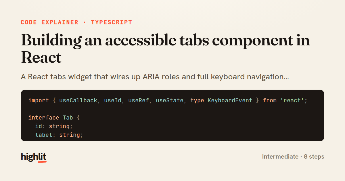
Building an accessible tabs component in React
A React tabs widget that wires up ARIA roles and full keyboard navigation following the WAI-ARIA pattern.
Explained by
highlit
1import { useCallback, useId, useRef, useState, type KeyboardEvent } from 'react';
2
3interface Tab {
4 id: string;
5 label: string;
6 content: React.ReactNode;
7}
8
9export function Tabs({ tabs }: { tabs: Tab[] }) {
10 const baseId = useId();
11 const [active, setActive] = useState(0);
12 const tabRefs = useRef<(HTMLButtonElement | null)[]>([]);
13
14 const focusTab = useCallback((index: number) => {
15 const next = (index + tabs.length) % tabs.length;
16 setActive(next);
17 tabRefs.current[next]?.focus();
18 }, [tabs.length]);
19
20 const onKeyDown = (event: KeyboardEvent<HTMLButtonElement>, index: number) => {
21 switch (event.key) {
22 case 'ArrowRight': event.preventDefault(); focusTab(index + 1); break;
23 case 'ArrowLeft': event.preventDefault(); focusTab(index - 1); break;
24 case 'Home': event.preventDefault(); focusTab(0); break;
25 case 'End': event.preventDefault(); focusTab(tabs.length - 1); break;
26 }
27 };
28
29 return (
30 <div className="tabs">
31 <div role="tablist" aria-label="Content sections">
32 {tabs.map((tab, index) => (
33 <button
34 key={tab.id}
35 ref={(el) => { tabRefs.current[index] = el; }}
36 role="tab"
37 id={`${baseId}-tab-${tab.id}`}
38 aria-controls={`${baseId}-panel-${tab.id}`}
39 aria-selected={active === index}
40 tabIndex={active === index ? 0 : -1}
41 onClick={() => setActive(index)}
42 onKeyDown={(event) => onKeyDown(event, index)}
43 >
44 {tab.label}
45 </button>
46 ))}
47 </div>
48 {tabs.map((tab, index) => (
49 <div
50 key={tab.id}
51 role="tabpanel"
52 id={`${baseId}-panel-${tab.id}`}
53 aria-labelledby={`${baseId}-tab-${tab.id}`}
54 hidden={active !== index}
55 tabIndex={0}
56 >
57 {tab.content}
58 </div>
59 ))}
60 </div>
61 );
62}
01 / 01
STEP 01
‹ swipe to step through ›
Walkthrough
Space play
←→ step
click any line
Three takeaways
- 1Accessible widgets need ARIA roles, relationships, and keyboard handling working together — not just click handlers.
- 2A roving tabIndex (0 on the active tab, -1 on the rest) keeps a group of controls as a single tab stop.
- 3useId gives stable, unique ids so aria-controls and aria-labelledby can cross-reference elements reliably.
Related explainers
typescript
import { registerLocaleData } from '@angular/common';
import localeFr from '@angular/common/locales/fr';
import localeFrExtra from '@angular/common/locales/extra/fr';
import localeDe from '@angular/common/locales/de';
Locale-aware bootstrapping in Angular
i18n
localization
dependency-injection
Intermediate
8 steps
typescript
import { Module } from '@nestjs/common';
import { ConfigModule } from '@nestjs/config';
import * as Joi from 'joi';
Validating env config at boot in NestJS
configuration
schema-validation
environment-variables
Intermediate
8 steps
typescript
import { Inject, Injectable, Logger } from '@nestjs/common';
import { CACHE_MANAGER } from '@nestjs/cache-manager';
import { Cache } from 'cache-manager';
import { InjectRepository } from '@nestjs/typeorm';
A cache-aside country lookup in NestJS
cache-aside
dependency-injection
batch-lookup
Intermediate
8 steps
typescript
import { Injectable, effect, signal, computed } from '@angular/core';

interface Preferences {
  theme: 'light' | 'dark';
A signal-based preferences store in Angular
signals
state-management
persistence
Intermediate
7 steps
typescript
import { useEffect, useState } from "react";

interface Section {
  id: string;
Building a scroll-spy hook in React
custom-hooks
intersectionobserver
dom-observation
Intermediate
8 steps
typescript
import { Injectable, Scope, Inject, NotFoundException } from '@nestjs/common';
import { REQUEST } from '@nestjs/core';
import { Request } from 'express';
import { DataSource } from 'typeorm';
Per-tenant database connections in NestJS
multi-tenancy
connection-pooling
dependency-injection
Advanced
8 steps
Share this explainer
Here's the card — post it anywhere.
Made with highlit — turn any snippet into a walkthrough like this in about a minute.
Explain your code
Embed this explainer
Drop the interactive walkthrough into a blog or docs. Views never cost a credit.
<iframe src="https://highlit.co/explainers/building-an-accessible-tabs-component-in-react-explained-typescript-1ff6/embed?autoplay=1" width="100%" height="520" loading="lazy" style="border:0"></iframe>
Autoplay is on by default — add ?autoplay=0 to start paused.